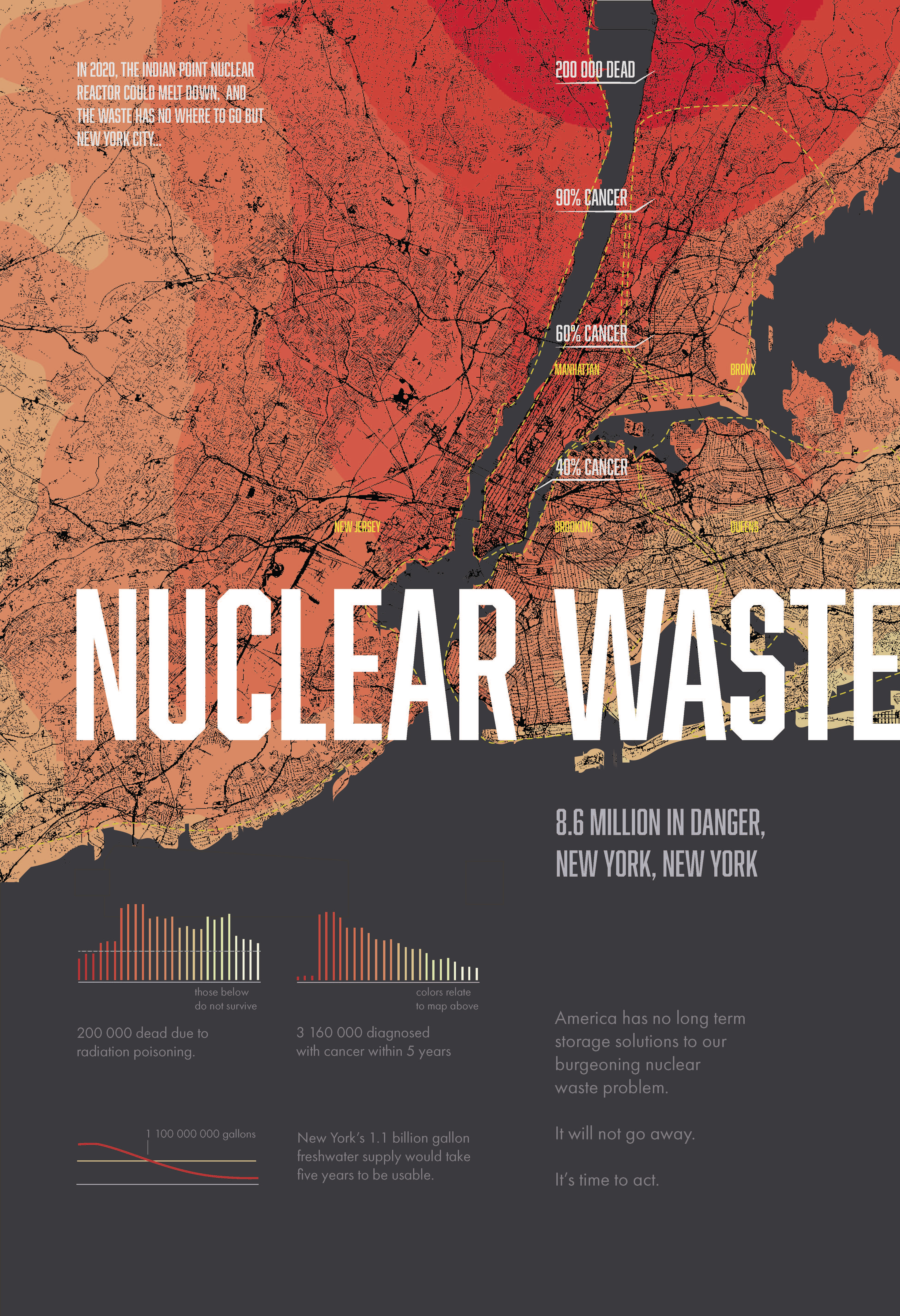
This infographic explores quantitative data representation. In particular it imagines a scenario where the nuclear waste stored just north of New York City was to contaminate the local water systems. The intensity of red on the map below directly correlates with the amount of radiation, graphed over a map of New York City and the surrounding neighborhoods.