KBX TMS
CASE STUDY
FIGMA
ILLUSTRATOR
AFTEREFFECTS
PENDO
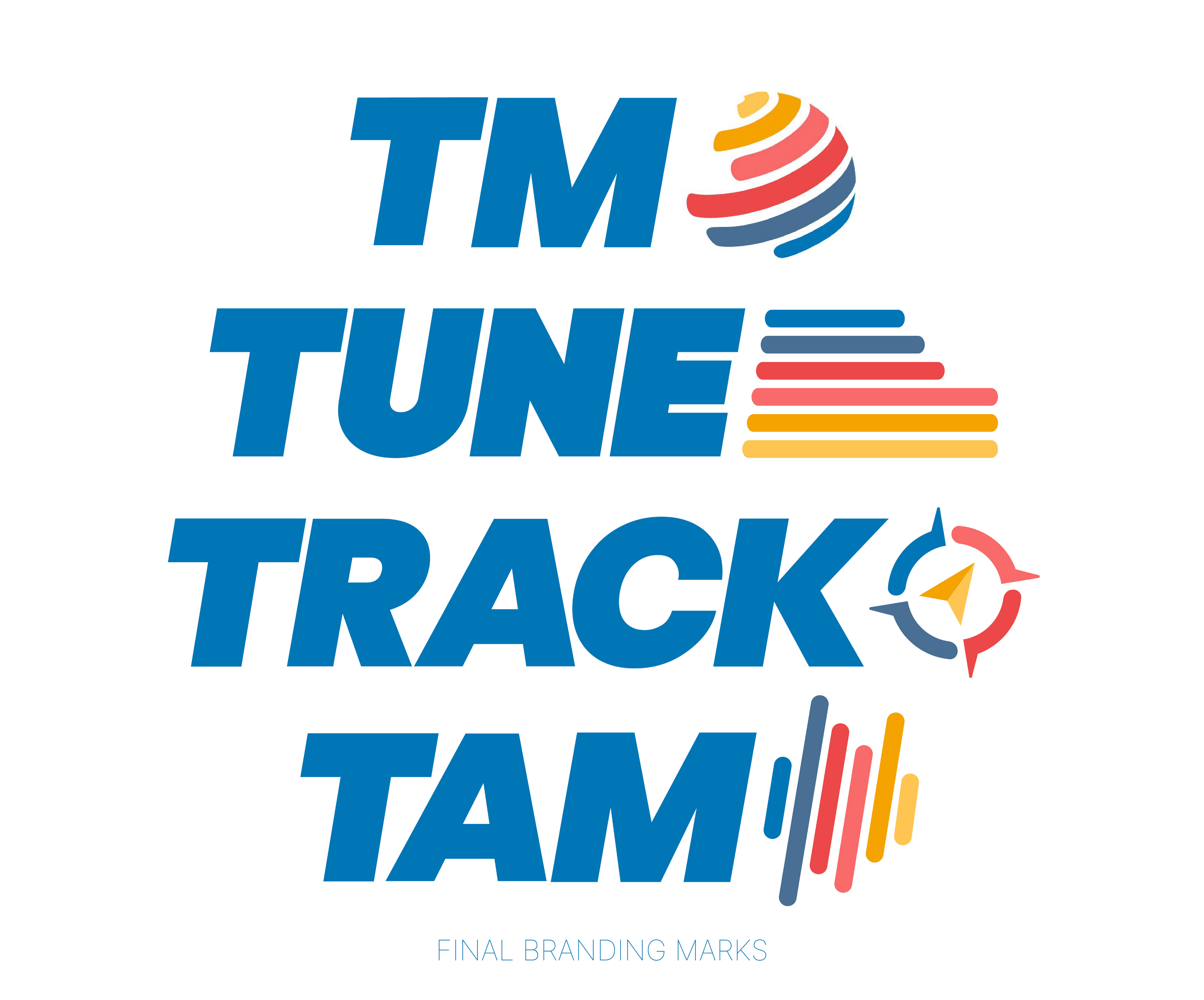
TMS | Transport Management System TUNE | Truck Dispatch Mobile App TRACK | Shipment Tracking Software TAM | Transportation Asset Manager
MY ROLE
UX Product, Brand Designer, System Designer
Created and maintained the Figma component library for a team of 10 designers, and established software architecture integration.
Worked with business process leaders to evaluate needed changes in the existing business to drive UX projects.
Closely worked with the software architecture team to ensure branding compliance and UI element consistency.
OVERVIEW
As a founding designer at KBX, I was tasked with designing the user experience and brand identities for the TMS software product, as well as the associated software products TUNE, Track, and TAM. The goal for this software suite was to create a fully functioning TMS system for Koch Industries, replacing vendor services with our new software product while improving on the market standard applications, for the purpose of optimizing Koch Internal services first, and SaaS as a second consideration. The old TMS system, TOPS, was decades old, difficult to navigate, and relied heavily on industry knowledge. The new TM successfully improved the rate of order creation and fulfillment, as well as the quality of data and choices for logistics professionals, providing a fully accessible, marketable product.
Problem Statement
Users managing logistics workflows encountered challenges efficiently inputting and reviewing order details. The previous system lacked intuitive navigation, leading to:
• Cognitive overload due to dense, text-heavy forms
• Unclear hierarchy in data fields, causing confusion while
input sequencing
• Inefficient selection processes for preferred transportation methods and rail route details
• Accessibility gaps, particularly in contrast and interactive elements
Branding
Featured above, the finalized brandmarks I created for the software suite. These also had custom .JSON loading spinners that I made. These unique .JSON animations, made in AfterEffects and Lottiefiles, were lightweight (less than 3mb) and easy to edit and load onto any page.
All of the branding was successfully approved through the corporate structure, and the work I did to create them is proprietary to the company.
12 became 4
How good UX
improved a workflow
Manual Order Entry Redesign
Through user interviews, data analysis, and usability testing, key pain points were identified in a core function of the product that had been carried over from the legacy system. Manual Order entry was a personal passion project of mine; I recognized, as a user, it was blocking part of the workflow, so I championed its redesign on the development roadmap. By carefully aligning with the customers who were already using the flow, as well as future business needs, and the architecture team, I spearheaded an effort that resulted in a fundamental improvement to the order entry process.
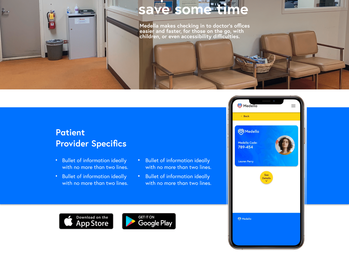
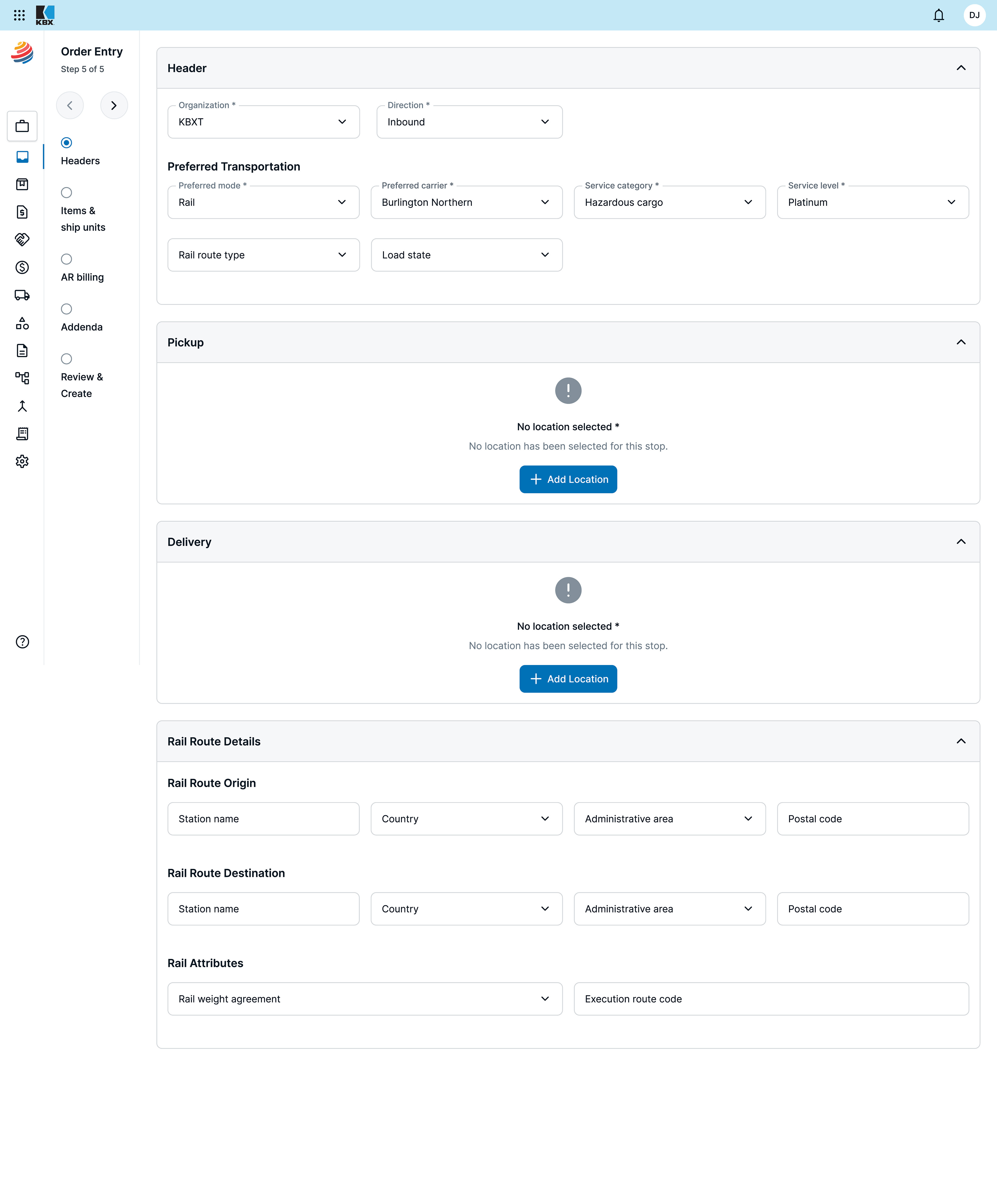
As part of the redesign, I proposed a new saving paradigm that was adopted by the development team, which enabled the change to how users interacted with save functions across the product. This change allowed the service to adjust how much data was needed to create an order, which, combined with automations, resulted in far fewer entries that a user had to manually fill. As a result, the order creation process went from 12 steps to just 4, and reduced saving times for all documents across the TM from about 30 seconds to less than 3.
Below is the final step of the new Order Entry process.
Design Solutions
Information
Architecture Improvements
• Consolidated related fields under clear sections (e.g., Headers, Preferred Transportation, and Rail Route Details)
• Implemented a progressive disclosure approach to minimize on-screen clutter
• Fundamentally changed the saving paradigm in the system so users could edit pieces of a document without needing to re-save the entirety of the document to all services, instead allowing the service to only resend to affected parts, significantly improving save and load times
Streamlined Data Input & Selection
• Drop downs and smart search for carriers, service categories, and route selection
• AI tool implemented into search and filter to allow plain text, user generated queries to be translated into the back-end's specific filter and search pattern
• Improved validation messaging for location selection errors
Enhanced Visual Hierarchy & UI Clarity
• Reorganized form layouts to prioritize essential information
• Improved contrast, spacing, and typography for readability
• Standardized iconography and error states for accessibility compliance
• Established AAA compliance for all public facing screens, including color matching, screen reading, and various other accessibility considerations
Established User
Data Collection Methods
Data Collection Methods
• Set up formal and regular communication with alpha generation users and subject matter experts to generate changes based on experience
• Established a Pendo testing system, and set up all screens for user metric gathering, this tool would be used to generate data on UI changes
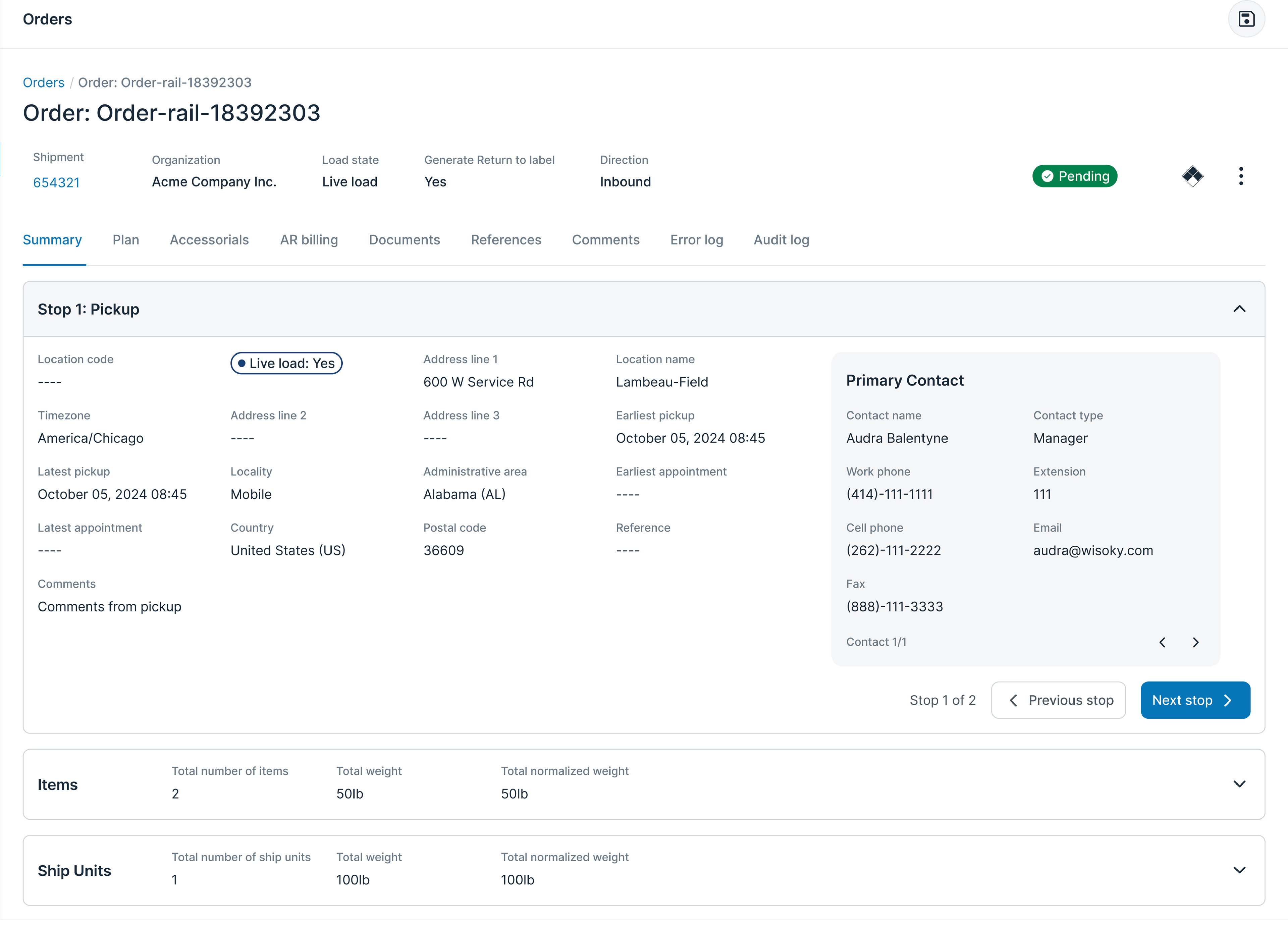
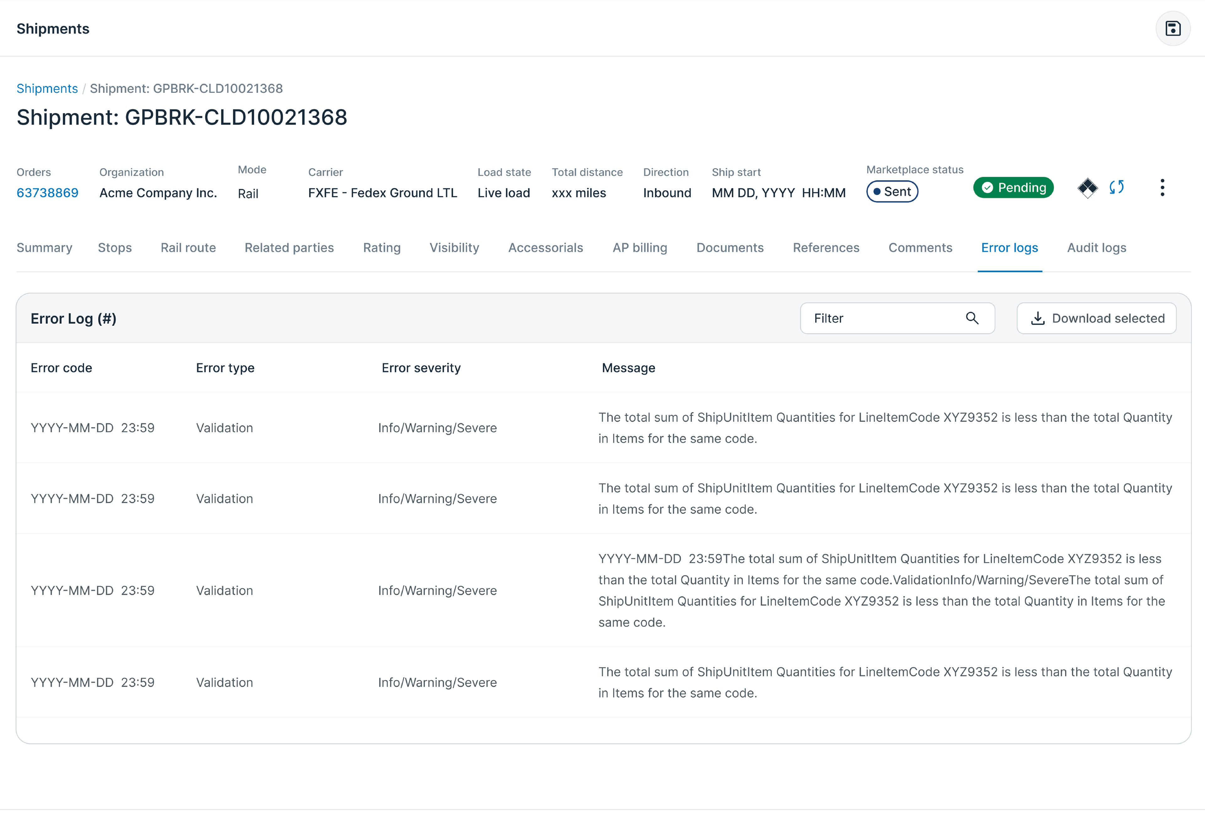
Final Design & Impact
The new TMS and other programs provide Koch Industries a strong place to go forward with their software development. Thanks to the work my team and I did for this project, they have not only the tools to evaluate future business needs and directions, but the ability to back those decisions up with user focused metrics. The flexible, comprehensive Figma library, integrated with Storybook, ensured that development teams could stay within a shared visual system with minimal effort on the part of any single developer. UI has been standardized across teams, and users already entered the ecosystem, saving Koch Industries a combined $90,000,000 in the first year of company-wide adoption.
I am proud of the work I did on this project, and I am confident that the system the UX team created for this software will continue to be an essential pillar of all future development at Koch. A key lesson that I have taken away from this project is that questioning assumptions, especially in software design, is a powerful tool to understanding the why of design—which is what truly drives valuable UX product design.